The purpose of Data Visualization is to identify patterns within the data. These patterns help clients understand performance, find anomalies, and recognize trends.
Data visualization for enterprise products requires a systematic approach that scales well. At the same time, it must clearly communicate the data. Automation may impact the ability to curate data. Specifically, automation may NOT allow the ability to order values, create categorized groups, and highlight specific categories.

A data visualization is a visual representation of the data. A good data visualization is a clear, accurate, understandable, and engaging representation of the data. The most basic design decisions have the biggest impact on our clients’ ability to understand the visualization.
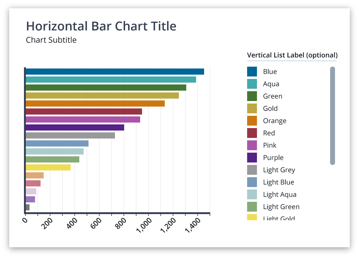
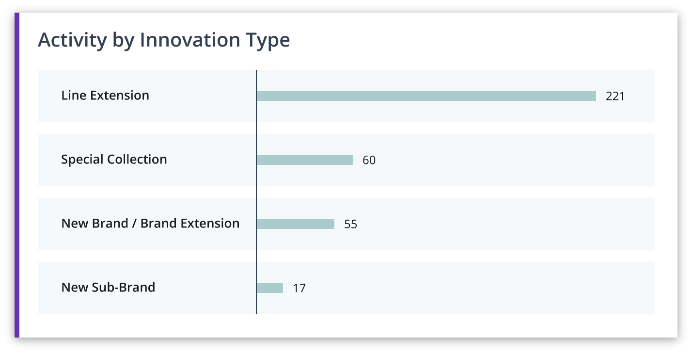
Orientation is particularly important when presenting bar charts. Consider the implications of horizontal vs vertical bar charts. When designing for desktop (16:9) there is more horizontal space than vertical. If the changes in values are small, it will be easier to compare the between bars when they are horizontal. In addition, vertical scrolling may naturally support a large number of categories. Lastly, given that data labels are easier to read when the text is written horizontally, a horizontal bar chart may be a better choice if a chart contains long data labels.
Consider what the visualization needs to communicate well. The visualization should clearly communicate the data without distortion or error. It should also provide context. Data visualization in Nielsen products may incorporate filters and / or view switchers which add context by ordering performance, providing categorization, and creating subgroupings.
Axes, labels, and legends are universal elements that orient our clients to the data visualization. Each of these elements add context and clarity to the view of the visualization.
BEST PRACTICES
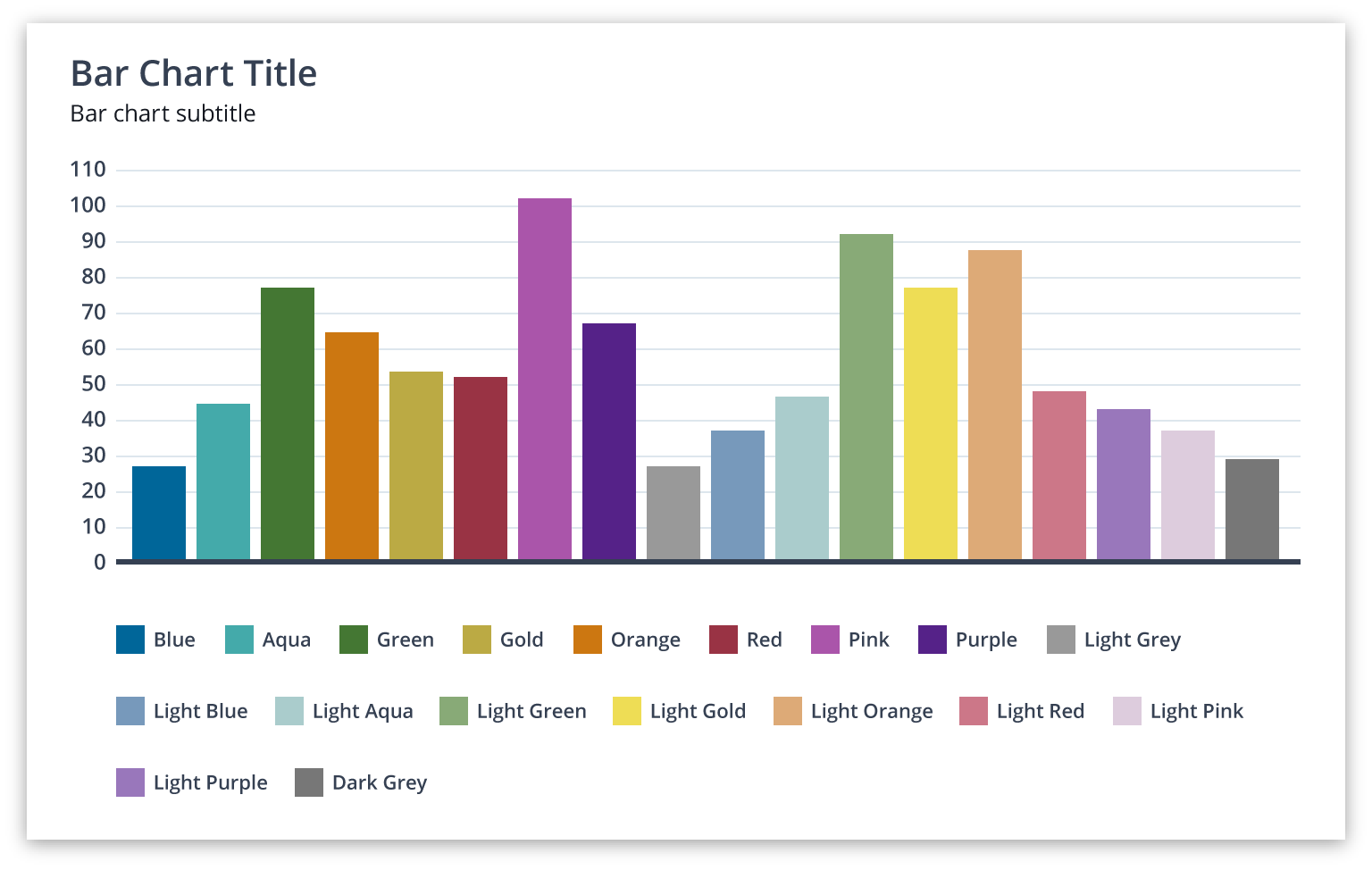
Legends are an alternative form of labeling used when there is insufficient room to display categories directly on the visualization, and to avoid label redundancy when a data category appears multiple times within the same visualization. Like labels, they should be clear and direct in an effort to elevate the visualization. They do have the added benefit of interactive filtering by being able to turn categories on and off. There are two versions, horizontal and vertical. In both cases, the order of the labels should correspond to the order of the data groups in the visualization.
Labels specify metrics (such as on axes) and data groups. They provide meaning, context, and clarity to the visualization. Labels should be clear, direct, and relevant to the information in the visualization. Leverage titles and subtitles as labels to reduce ambiguity, lessen the amount of text required, and avoid repetition of information.
To improve comprehension and readability follow these best practices:
• Orient type horizontally whenever possible.
• Rotate type 45º if space is tight.
• Where possible, avoid orienting type vertically, as it is difficult to read.
• Apply labels directly to the visualization in lieu of a legend if there is sufficient space.
ORIENT TYPE HORIZONTALLY
ROTATE TYPE 45º IF SPACE IS TIGHT
USE WITH CAUTION: VERTICALLY ORIENTED TYPE
HORIZONTAL LIST
Use a legend as a horizontal list if the entire width of the screen is used to display the data visualization. Designers may use discretion in
placing the legend above or below the visualization. If there are several visualizations stacked vertically, place the legend between the subtitle and visualization.
VERTICAL LIST
A vertical list may be placed to the right or left of the visualization if there is sufficient horizontal space.
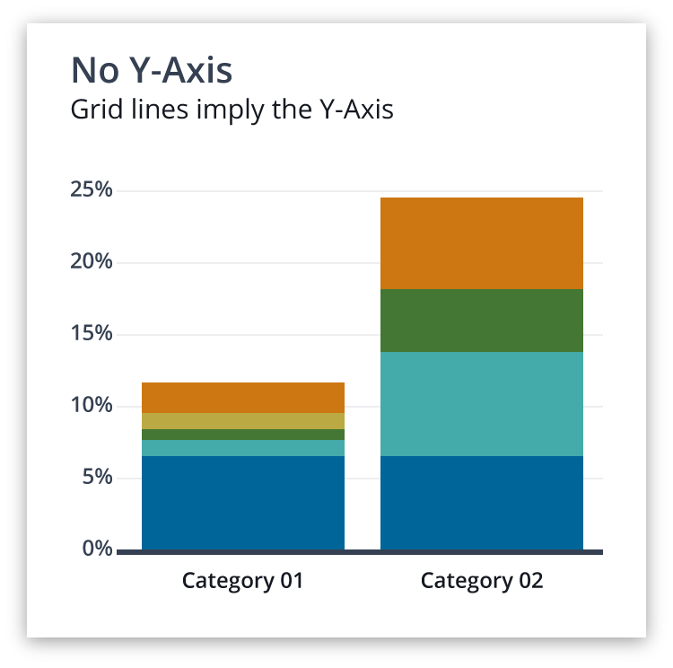
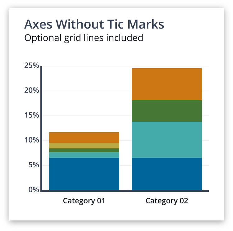
Axes define the boundaries of the visualization. They also increment the metric units and / or categories. Tick marks and grid lines are optional but may support clients understanding of values.
With axes that represent continuous data, consider the scale to best display differences between data values; scale corresponds to the physical spacing (i.e., gap size) and numeric spacing (i.e., the unit increments which divide up a scale) of number labels on the axis.
LABELS
Data Visualization Title
Font: Open Sans
Font Weight: 600 (Semibold)
Font Size: 20px
Font Color: Gray 800 (#354052)
Data Visualization Subtitle
Font: Open Sans
Font Weight: 500 (Regular)
Font Size: 15px
Font Color: Gray 900 (#151921)
Axis Labels
Font: Open Sans
Font Weight: 600 (Semibold)
Font Size: 11px (small)
12px (medium)
Font Color: Gray 900 (#151921)
LEGENDS
Legend Title (Optional)
Font: Open Sans
Font Weight: 600(Semibold)
Font Size: 12px
Font Color: Gray 900 (#151921)
Font Case: Uppercase
Legend Labels
See Axis Labels
AXES
Primary Axes
Width / Height: 3px (.1875rem)
Color: Gray 900 (#151921)
Grid Lines
Width / Height: 1px (.1875rem)
Color: Gray 200 (#DDE6ED)

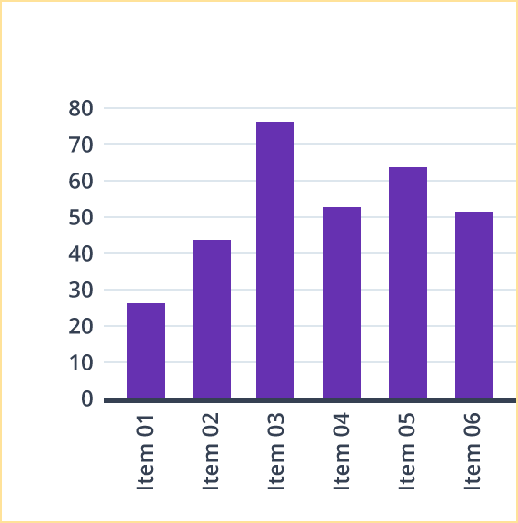
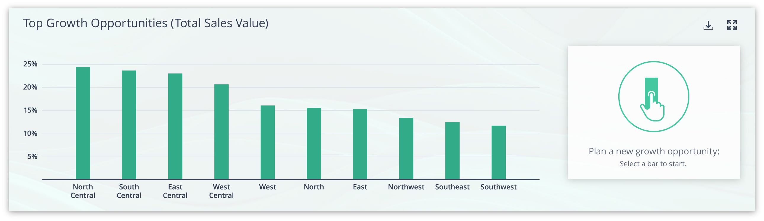
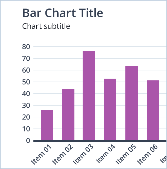
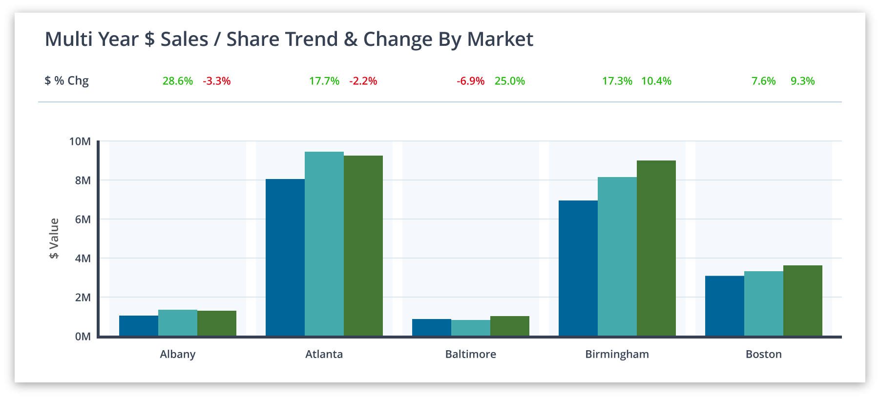
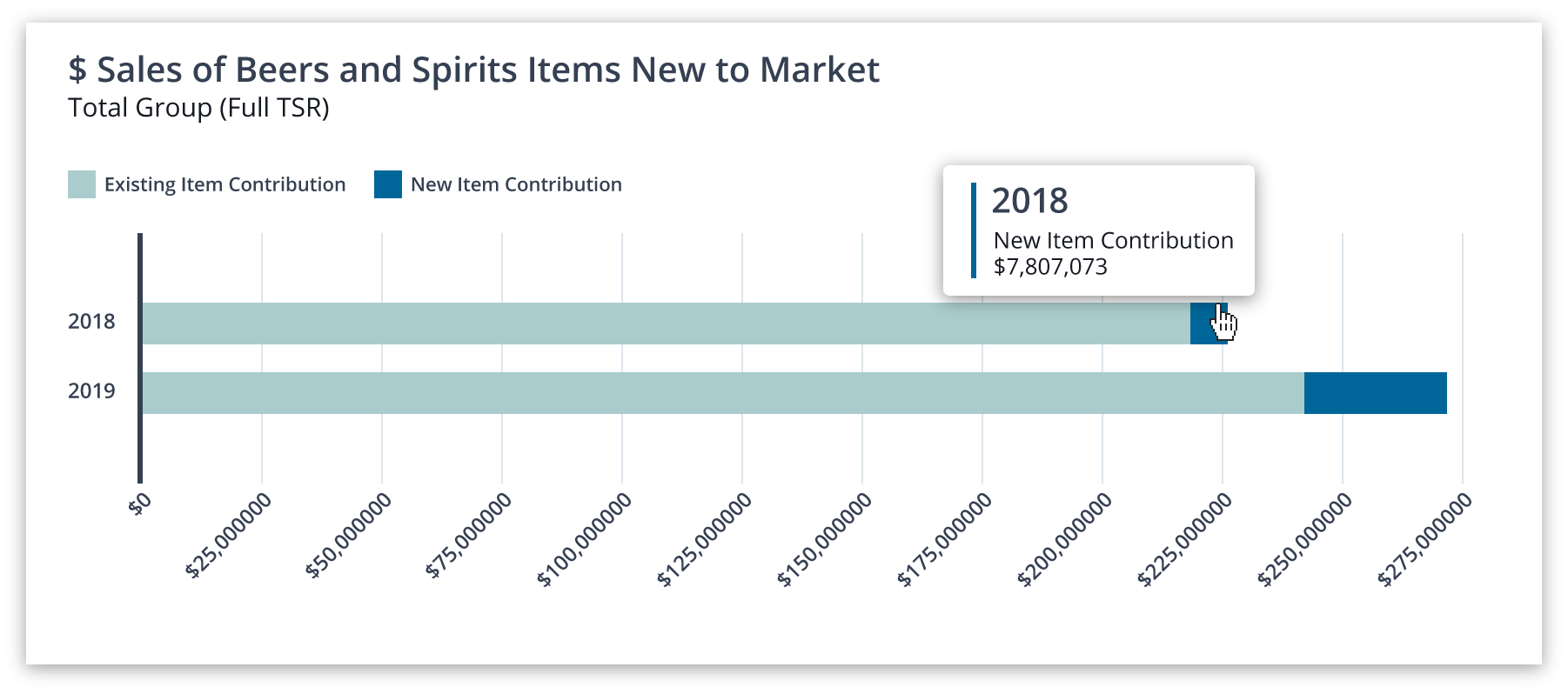
Bar charts display performance across a categorical variable. Clients are easily able to compare performance data values (bar lengths) across the categorical variable. Orient the bar chart either horizontally or vertically to optimize the understanding of the data (see Overview for factors to consider).
STANDARD BAR
A typical bar chart contains one bar (one data point) for each data category.
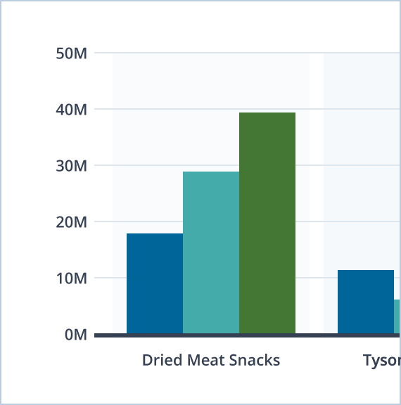
GROUPED BAR
Similar to a Typical Bar chart, except each data group has multiple data points (bars). Multiple bars (one bar for each data category) are ‘grouped’ together by the categorical variable displayed on the axis. The grouped bar chart excels when the client is comparing data values within a category (of the categorical variable).
STACKED BAR
Each bar is divided up such that it is composed of all data categories, and together represents a single category (of the categorical variable). The total height of each bar corresponds to the sum of all data values within it (often 100%, if data values are expressed as percentages). The stacked chart excels when the client is comparing how data categories contribute to a total value; this chart type is less helpful when the client is comparing how a data category’s value changes with the categorical variable (consider a Grouped Bar chart instead).
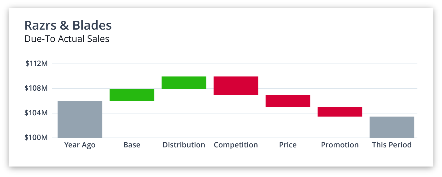
WATERFALL
The left-most bar represents an initial value and the right-most bar represents a final value. All bars in between represent different categories which contributed to the final value. Those bars are colored depending on if the category increased or decreased the initial value (often green or red, respectively).

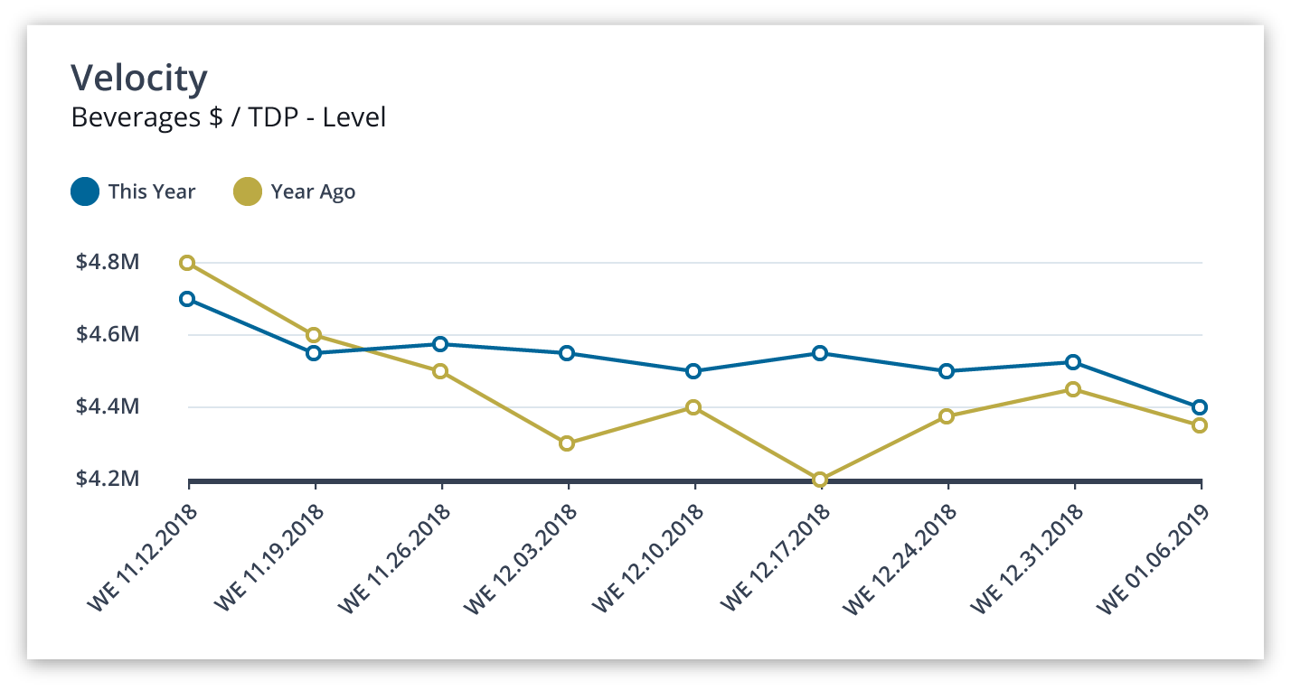
Line charts display performance across a continuous variable on the x-axis (frequently representing time). Clients are easily able to observe trends for individual data categories (e.g., How does a data category change over time?) and between data categories (e.g., Which data categories behave similarly over time?) across the continuous variable.
To improve comprehension and readability follow these best practices:
• Use a pie or donut chart if: there are 10 or less segments, if most of the segments are not small, and if the segments are not similar in size.
• Use a stacked bar chart instead if: the above criteria are not met (# segments, segment size, segment size similarity), and if visualizing multiple sets of proportions (e.g., side-by-side Pie charts; these charts do not work well when the client is comparing slices across charts).
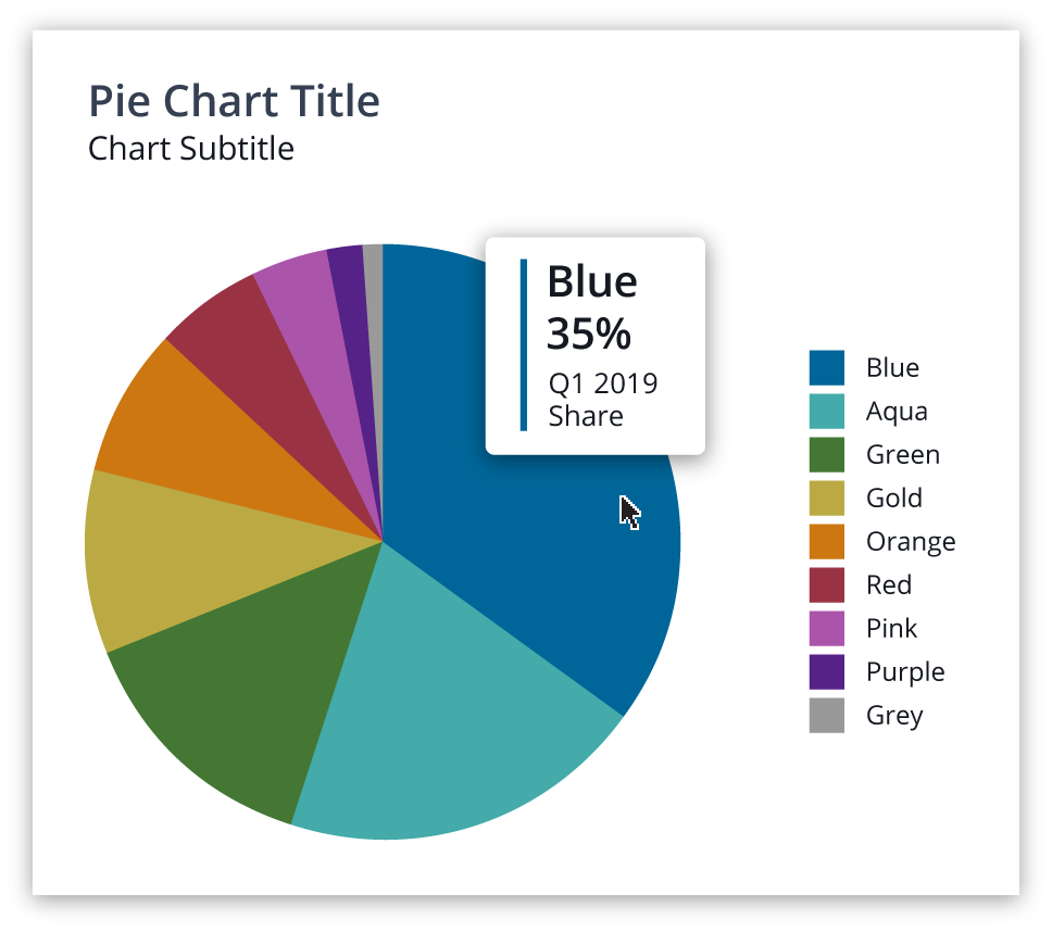
PIE CHART
Pie charts are best used to portray share data in a very simple way, as proportions of a whole.
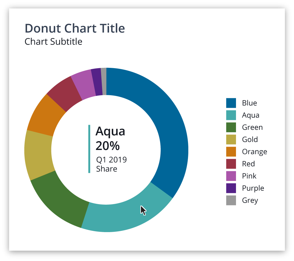
DONUT CHART
Donut charts are the same as a Pie chart, except the center is cut out. This creates a series of curved line segments in which the length of the curve designates the portion of the whole. The center may provide opportunity for labelling or interaction.
BEST PRACTICES
Pie and Donut charts are simple visualizations used to show contribution or share of different data categories. Each ‘slice’ is proportional to the fraction of the total which the chart represents. Pie and Donut charts excel at displaying data categories as proportions of a whole and are visually appealing.
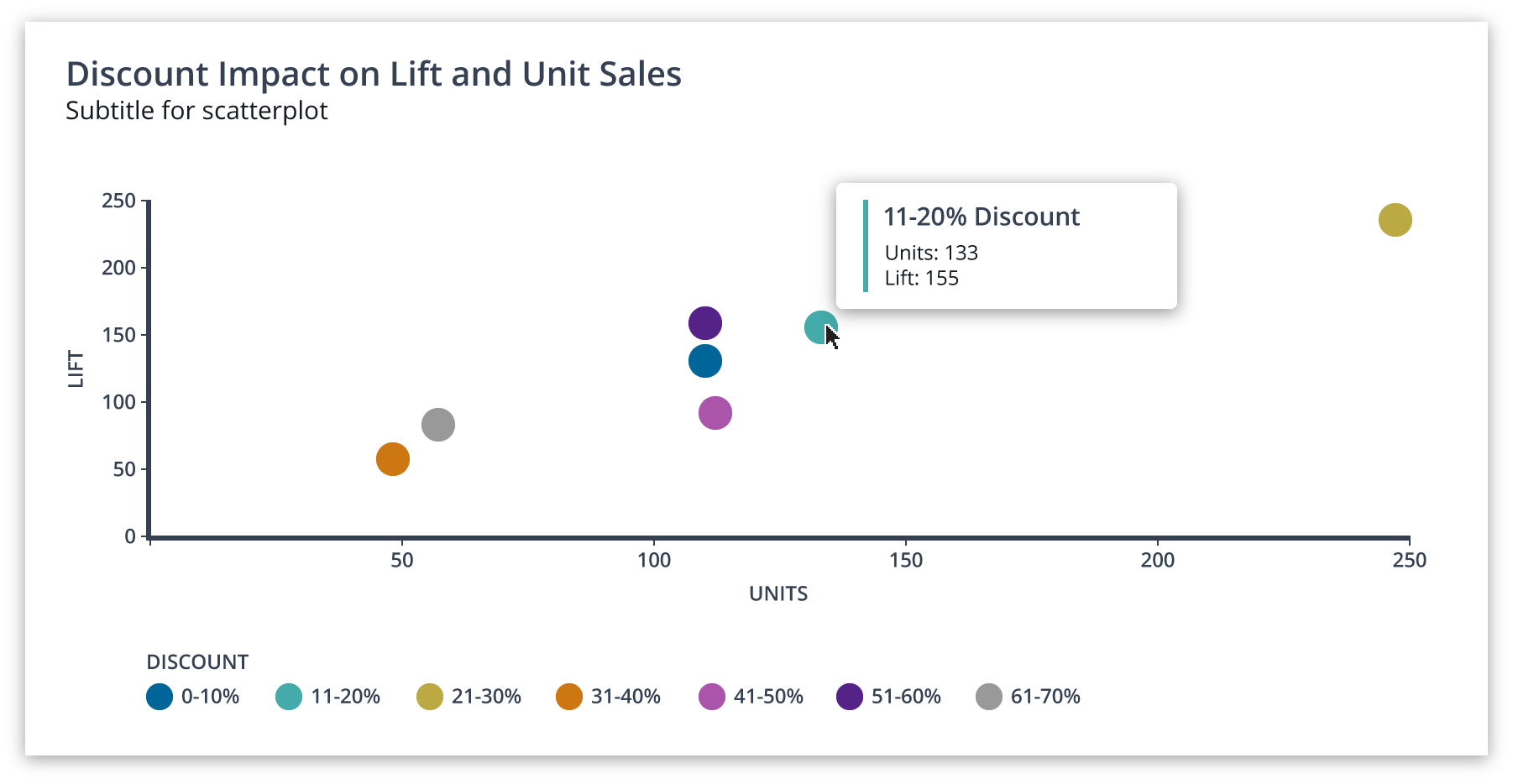
Scatter Plots display data categories across two continuous variables. Similar to Line charts, except the x-axis variable is not ordered/sequential (like time). Clients are easily able to observe trends (such as correlations) between the two continuous variables across each data category.
STANDARD SCATTER PLOT
These charts display data categories across two continuous variables. The x-axis variable is not non-sequential. This allows clients to see how the two variables may correlate.
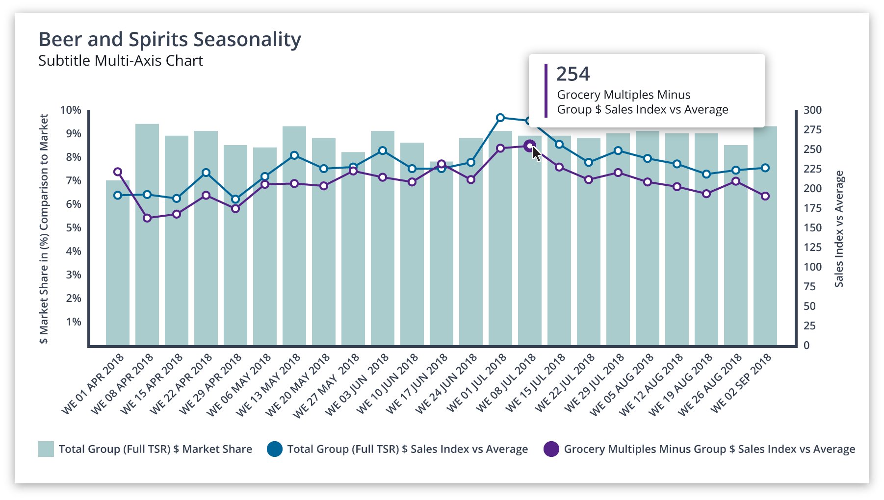
A Multi-Axis chart is a combination of two (or more) Bar and/or Line charts in a single data visualization. Because each sub-chart represents a different y-axis measure, the left y-axis corresponds to one sub-chart, and the right y-axis corresponds to the other chart.
We recommend that Multi-Axis charts be used sparingly. Although Multi-Axis charts excel in being space-efficient, there are drawbacks:
• Confusion regarding which bars/lines correspond to which y-axis.
• Confusion with comparing absolute data values across sub-charts (e.g., comparing bar values with line values).

ATLAS


BASED ON YOUR FILTER,
THERE IS NOTHING TO SHOW


Change filter to see results.
Version 8.12 - Updated 11, April 2019
Copyright © 2019 The Nielsen Company. The Science Behind What's Next™. All Rights Reserved.


Overview
Labels Legends & Axes
Bar Chart
Line Chart
Pie & Donut
Scatter Plots
Multi-Axis